


Census Regions and Divisions

Set up student focus groups, with an emphasis on students from underrepresented areas, to capture what led them to applyEngage with the leadership of popular schools in the Northeast and Midwest to share recruitment best practices and lessons learnedReview and revise the college’s recruitment strategy in line with collected findings
Reevaluate criteria used to assess student applicants, to identify potential variables that may be unfairly filtering out womenEngage with leadership and students to reaffirm the college’s dedication to inclusivity and equality - and dedicate resources towards this causeRevise the current marketing strategy used by the college to ensure it caters to female applicants
The dataset contains 81 valid admission results from the CSV file
SummerStudentAdmissions2.csv.
Three versions of this dataset are included on the right hand side:
Due to the lack of information, some of the variables and contents from the dataset are interpreted intuitively.
In the cleaned dataset,
gender=-1 means the gender is undisclosed.volunteer_level is ranked from 5 to 0.gpa is calculated on a 4.0 scale.writing_score should be on a 100 scale.test_score has rather limited information.work_exp’s unit is year.The dashboard is powered by
flexdashboardDTplotlyhrbrmstr.This project is presented by Dan Cisek and Rui Qiu.
Please feel free to star or fork this repository.
---
title: "Admission Dashboard"
output:
flexdashboard::flex_dashboard:
storyboard: true
orientation: columns
vertical_layout: fill
social: ["twitter", "linkedin"]
source_code: embed
theme: bootstrap
logo: static/logo.png
favicon: static/favicon.png
css: style.css
---
```{r setup-and-data-loading, include=FALSE}
gc()
rm(list = ls())
if (!require("pacman")) install.packages("pacman")
pacman::p_load(
tidyverse, flexdashboard,
here, styler, patchwork,
hrbrthemes, ggthemes, ggtext, plotly,
glue, waffle, DT, geofacet, ggbeeswarm,
ggridges, treemapify
)
dat <- read_csv(here("data/data-cleaned.csv"))
style_file("index.Rmd")
# standardize all numeric variables
dat_stand <- dat |>
mutate(
decision = as_factor(decision),
state = as_factor(state),
gender = as_factor(gender),
across(where(is.numeric), ~ round(scale(.)[, 1], 2)),
partition = case_when(
state %in% c("California", "Colorado", "Utah", "Oregon") ~ "west",
state %in% c("Vermont", "New York") ~ "northeast",
TRUE ~ "south"
)
)
dat_stand_long <- dat_stand |> pivot_longer(
cols = c(
gpa, work_exp, test_score,
writing_score, volunteer_level
),
names_to = "variable",
values_to = "value"
)
dat_long <- dat |>
mutate(partition = case_when(
state %in% c("California", "Colorado", "Utah", "Oregon") ~ "west",
state %in% c("Vermont", "New York") ~ "northeast",
TRUE ~ "south"
)) |>
pivot_longer(
cols = c(
gpa, work_exp, test_score,
writing_score, volunteer_level
),
names_to = "variable",
values_to = "value"
)
```
Insights {.storyboard data-icon="fa-chart-line" data-commentary-width=200}
=====================================
### **Overall admission results**
```{r, fig.width=8, fig.height=8}
dat |>
count(decision) -> admission_summary
p1 <- ggplot(admission_summary, aes(fill = decision, values = n)) +
geom_waffle(color = "white", size = 1.125, n_rows = 9, flip = TRUE) +
scale_fill_manual(
values = c("#1A6899", "#FC5449", "#FFCF58"),
labels = c("Admit", "Decline", "Waitlist")
) +
coord_equal() +
theme_ipsum_rc() +
theme(
legend.position = "bottom",
legend.title = element_text(color = "#000000"),
legend.text = element_text(color = "#000000"),
axis.title.y = element_text(
family = "IBM Plex Sans", face = "bold"
),
axis.title.x = element_text(
family = "IBM Plex Sans", face = "bold"
),
axis.text.x = element_blank(),
axis.text.y = element_blank(),
text = element_text(
family = "IBM Plex Sans",
color = "#3B372E"
),
plot.title = element_text(hjust = 0.5),
plot.subtitle = element_markdown(hjust = 0.5),
plot.caption = element_markdown(),
panel.grid.major = element_blank(),
panel.grid.minor = element_blank()
) +
labs(
title = "SUMMER 2022 ADMISSION RESULTS",
subtitle = "BAD DATA EXCLUDED.",
caption = glue("SOURCE: SUMMERSTUDENTADMISSION2.CSV"),
x = "",
y = ""
)
p1
```
***
- **81 applicants.**
- Accepted (~35%), rejected (~30%), and waitlisted (~35%).
- Average acceptance among U.S.-based colleges in 2021 was 66%. [Source](https://www.collegedata.com/resources/the-facts-on-fit/understanding-college-selectivity).
- **Increased selectivity.**
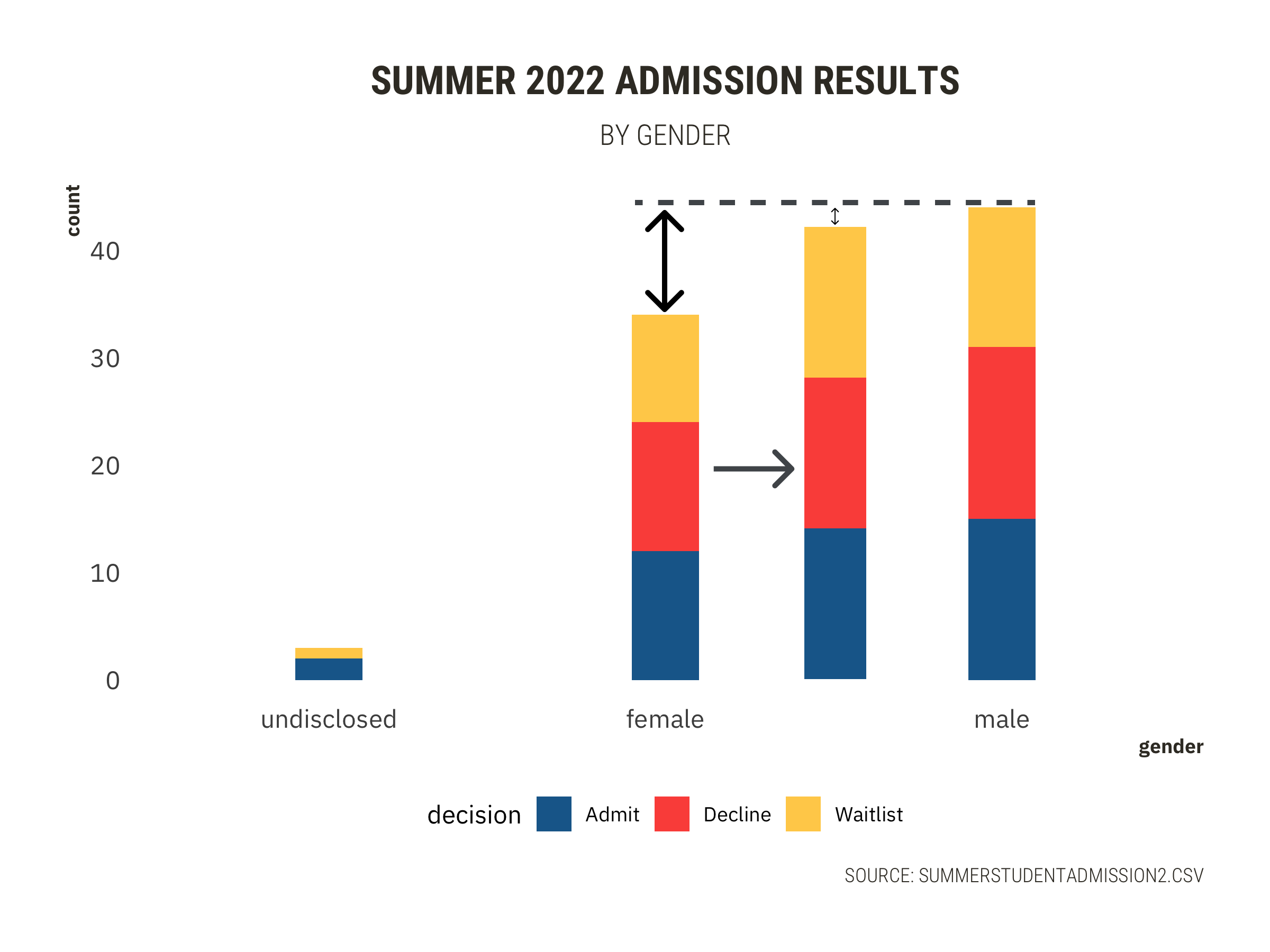
### **Admission results by gender**
```{r, fig.width=12,fig.height=8}
p2 <- dat |>
select(decision, gender) |>
mutate(gender = as_factor(gender)) |>
ggplot(aes(gender)) +
geom_bar(aes(fill = decision),
position = position_stack(reverse = TRUE),
width = 0.2
) +
scale_fill_manual(
values = c("#1A6899", "#FC5449", "#FFCF58"),
labels = c("Admit", "Decline", "Waitlist")
) +
scale_x_discrete(labels = c("undisclosed", "female", "male")) +
theme_ipsum_rc() +
theme(
legend.position = "bottom",
legend.title = element_text(color = "#000000"),
legend.text = element_text(color = "#000000"),
axis.title.y = element_text(
family = "IBM Plex Sans", face = "bold"
),
axis.title.x = element_text(
family = "IBM Plex Sans", face = "bold"
),
axis.text.x = element_text(),
axis.text.y = element_text(),
text = element_text(
family = "IBM Plex Sans",
color = "#3B372E"
),
plot.title = element_text(hjust = 0.5),
plot.subtitle = element_markdown(hjust = 0.5),
plot.caption = element_markdown(),
panel.grid.major = element_blank(),
panel.grid.minor = element_blank()
) +
labs(
title = "SUMMER 2022 ADMISSION RESULTS",
subtitle = "BY GENDER",
caption = glue("SOURCE: SUMMERSTUDENTADMISSION2.CSV"),
x = "gender",
y = "count"
)
p2
```
***
- male 44, admit 15 + decline 16 + waitlist 13
- female 34, admit 12 + decline 12 + waitlist 10
### **Applicants by geolocations (1)**
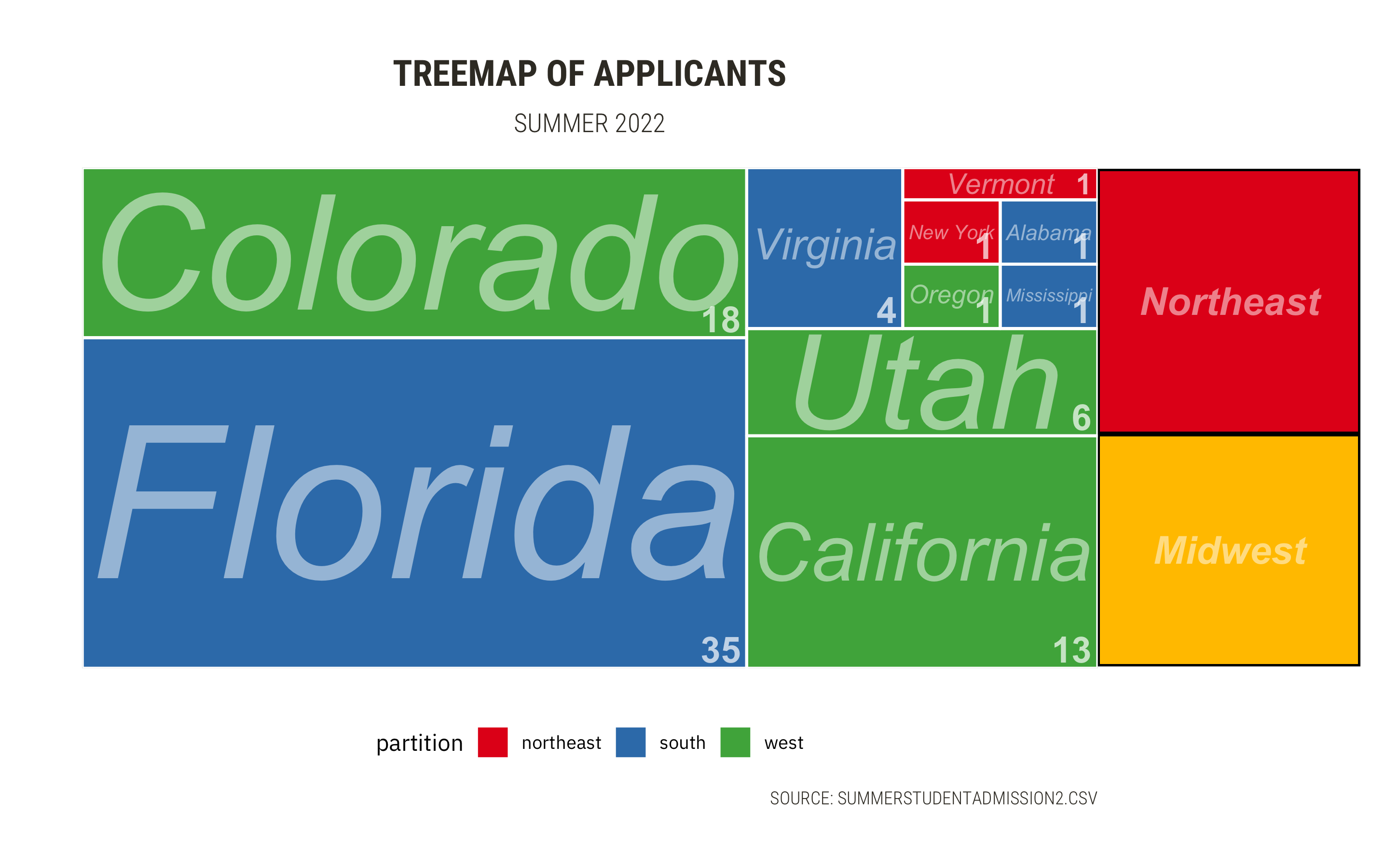
```{r, fig.width=12,fig.height=8}
p3 <- dat_stand |>
group_by(state, partition) |>
summarize(count = n()) |>
ggplot(aes(
area = count, fill = partition,
label = count, subgroup = state
)) +
geom_treemap() +
geom_treemap_subgroup_border(color = "white", size = 2) +
geom_treemap_subgroup_text(
place = "centre", grow = TRUE,
alpha = 0.5, colour = "white",
fontface = "italic"
) +
geom_treemap_text(
color = "white", place = "bottomright",
alpha = 0.7, fontface = "bold"
) +
scale_fill_brewer(palette = "Set1") +
theme_ipsum_rc() +
theme(
legend.position = "bottom",
legend.title = element_text(color = "#000000"),
legend.text = element_text(color = "#000000"),
axis.title.y = element_text(
family = "IBM Plex Sans", face = "bold"
),
axis.title.x = element_text(
family = "IBM Plex Sans", face = "bold"
),
# axis.text.x = element_blank(),
# axis.text.y = element_blank(),
text = element_text(
family = "IBM Plex Sans",
color = "#3B372E"
),
plot.title = element_text(hjust = 0.5),
plot.subtitle = element_markdown(hjust = 0.5),
plot.caption = element_markdown(),
panel.grid.major = element_blank(),
panel.grid.minor = element_blank()
) +
labs(
title = "TREEMAP OF APPLICANTS",
subtitle = "SUMMER 2022",
caption = glue("SOURCE: SUMMERSTUDENTADMISSION2.CSV"),
x = "",
y = ""
)
p3
```
***
{width=100%}
- Unfeasible to check the data by states.
- Aggregation by **regions**.
- Three states are the major origins of applicants.
### **Applicants by geolocations (2)**
```{r, fig.width=12,fig.height=8}
p4 <- dat_long |>
ggplot(aes(x = value, y = partition, color = partition, fill = partition)) +
geom_density_ridges(alpha = 0.7) +
scale_y_discrete(expand = c(0, 0)) + # will generally have to set the `expand` option
scale_x_continuous(expand = c(0, 0)) + # for both axes to remove unneeded padding
coord_cartesian(clip = "off") + # to avoid clipping of the very top of the top ridgeline +
facet_wrap(~variable, scales = "free") +
scale_fill_brewer(palette = "Set1") +
scale_color_brewer(palette = "Set1") +
theme_ipsum_rc() +
theme(
legend.position = "bottom",
legend.title = element_text(color = "#000000"),
legend.text = element_text(color = "#000000"),
axis.title.y = element_text(
family = "IBM Plex Sans", face = "bold"
),
axis.title.x = element_text(
family = "IBM Plex Sans", face = "bold"
),
# axis.text.x = element_blank(),
# axis.text.y = element_blank(),
text = element_text(
family = "IBM Plex Sans",
color = "#3B372E"
),
plot.title = element_text(hjust = 0.5),
plot.subtitle = element_markdown(hjust = 0.5),
plot.caption = element_markdown(),
panel.grid.major = element_blank(),
panel.grid.minor = element_blank()
) +
labs(
title = "RIDGEPLOT OF APPLICANTS' QUANTITATIVE MEASURES",
subtitle = "SUMMER 2022",
caption = glue("NOT ENOUGH NORTHEAST DATA FOR RIDGE PLOT.
SOURCE: SUMMERSTUDENTADMISSION2.CSV"),
x = "candidates' standardized measurement",
y = "density"
)
p4
```
***
- **No significant difference in quantitative measures of applicants.**
Actionable Decisions {data-icon="fa-graduation-cap" data-orientation=columns}
=====================================
Decision Column 1
-------------------------------------
### Scarcity of applicant records by region
- Recall:
- South (51%), West (46%)
- Northeast (3%), Midwest (0%)
#### Recommend an overhaul of the College's recruitment strategy, especially at it pertains to these areas.
- ✔️`Set up student focus groups, with an emphasis on students from underrepresented areas, to capture what led them to apply`
- ✔️`Engage with the leadership of popular schools in the Northeast and Midwest to share recruitment best practices and lessons learned`
- ✔️`Review and revise the college’s recruitment strategy in line with collected findings`
```{r}
# ggsave(filename = "static/decision2.png", plot = p2, width = 8, height = 6)
# ggsave(filename = "static/decision1.png", plot = p3, width = 8, height = 6)
```
{width=100%}
Decision Column 2
-------------------------------------
### Room for improvement in female applicants
- Recall:
- **Distinct** gender difference (12%).
- Similar acceptance rate. **No sexual discrimination present.**
#### Recommend the college takes a closer look at how it is marketing itself to and engaging with potential female applicants.
- ✔️`Reevaluate criteria used to assess student applicants, to identify potential variables that may be unfairly filtering out women`
- ✔️`Engage with leadership and students to reaffirm the college’s dedication to inclusivity and equality - and dedicate resources towards this cause`
- ✔️`Revise the current marketing strategy used by the college to ensure it caters to female applicants`
{width=100%}
About {data-icon="fa-info" data-orientation=columns}
=====================================
Left Column Text {data-width=350}
-----------------------------------------------------------------------
The dataset contains 81 valid admission results from the CSV file `SummerStudentAdmissions2.csv`.
Three versions of this dataset are included on the right hand side:
- Standardized data.
- Cleaned data.
- Raw data.
Due to the lack of information, some of the variables and contents from the dataset are interpreted intuitively.
In the cleaned dataset,
- `gender=-1` means the gender is undisclosed.
- `volunteer_level` is ranked from 5 to 0.
- `gpa` is calculated on a 4.0 scale.
- `writing_score` should be on a 100 scale.
- `test_score` has rather limited information.
- `work_exp`'s unit is year.
***
The dashboard is powered by
- [`flexdashboard`](https://pkgs.rstudio.com/flexdashboard/)
- [`DT`](https://rstudio.github.io/DT/)
- [`plotly`](https://plotly.com/)
- The static visualization theme is customized based on [`hrbrmstr`](https://github.com/hrbrmstr/hrbrthemes).
***
**This project is presented by [Dan Cisek](https://github.com/dcisek93) and [Rui Qiu](https://github.com/rexarski).**
**Please feel free to star or fork this repository.**
Right Column Table {.tabset data-width=650 data-height=1000}
-----------------------------------------------------------------------
### Standardized data
```{r}
DT::datatable(dat_stand,
options = list(
bPaginate = FALSE
),
style = "bootstrap"
) |>
formatStyle(
"decision",
backgroundColor = styleEqual(
c("Admit", "Decline", "Waitlist"),
c("#1A6899", "#FC5449", "#FFCF58")
)
) |>
formatStyle(c(
"gpa", "work_exp", "test_score", "writing_score",
"volunteer_level"
),
background = styleColorBar(range(c(
dat_stand$gpa, dat_stand$work_exp, dat_stand$test_score, dat_stand$writing_score,
dat_stand$volunteer_level
)), "lightblue"),
backgroundSize = "98% 88%",
backgroundRepeat = "no-repeat",
backgroundPosition = "center"
)
```
### Cleaned data
```{r}
dat <- read_csv("data/data-cleaned.csv")
DT::datatable(dat,
options = list(
bPaginate = FALSE
),
style = "bootstrap"
) |>
formatStyle(
"decision",
backgroundColor = styleEqual(
c("Admit", "Decline", "Waitlist"),
c("#1A6899", "#FC5449", "#FFCF58")
)
)
```
### Raw data
```{r}
DT::datatable(read_csv("data/SummerStudentAdmissions2.csv"),
options = list(
bPaginate = FALSE
),
style = "bootstrap"
)
```